Alliance for Housing & Healing
For individual brand’s guidelines for Alliance for Housing & Healing and Out Here Sexual Health, please see below:
Logo Family and Usage


Exclusion Zones
Do not separate components of the logo or rearrange it in any way. The logomark and logotype should always remain in the same proportion and spacing to each other as indicated and may never be separated or used separately.

Do’s and Dont’s


Color Palette
Color matching standard Pantone® references are included to ensure accuracy when reproducing the palette. Also included are the references for CMYK, RGB, and HEX values for consistency across different media. Where possible, the logos should be reproduced in the CMYK color process. Equivalent colors can be composed using the RGB and HEX references included when the logo is to be used digitally.

Typography
DO NOT use all caps for body copy or headlines unless absolutely necessary; i.e. on pieces that require additional emphasis. For example, pieces announcing FREE HIV Testing.
In design, mixed weights in headlines is encouraged. This added secondary design element echoes the logo and connects to our overall brand system. See example below.

Font Name

Applications
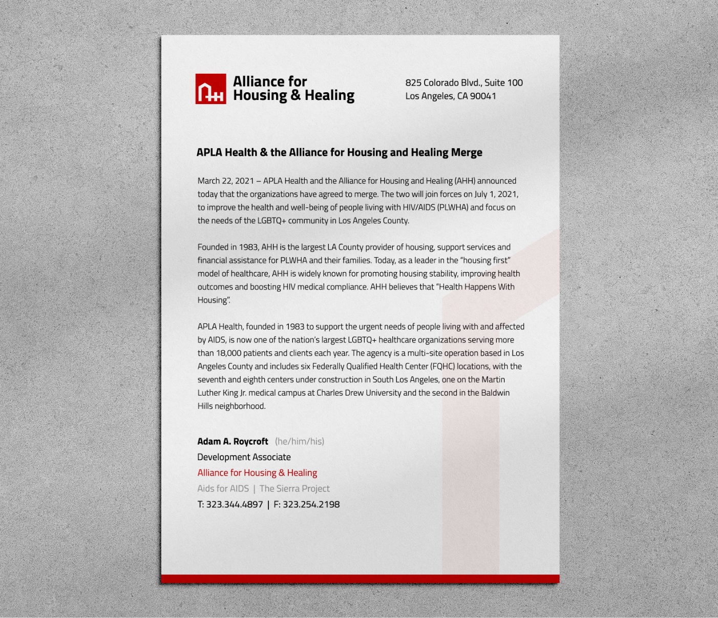
- Name
- Pronouns in Parentheticals (in Cool Gray)
- Title Alliance for Housing & Healing (in red)
- Aid for AIDS | The Serra Project (in Cool Gray)
- Telephone and Fax Number (or cell phone number)
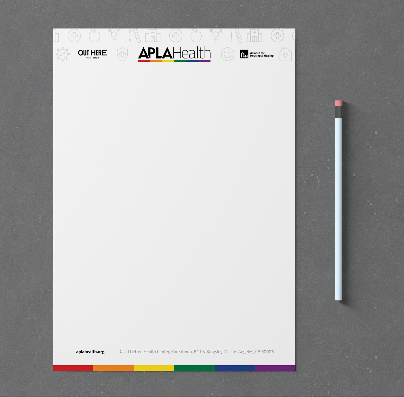
Outside of internal usage, the Alliance for Housing & Healing branded letterhead should not be used, and instead, use the co-branded letterhead pictured to the left. Your signature should contain the same elements that would appear on the primary letterhead.
If you have any questions, please reach out to the APLA Health marketing department.
To download the co-branded letterhead, please visit the APLA Health Brand Guidelines page.
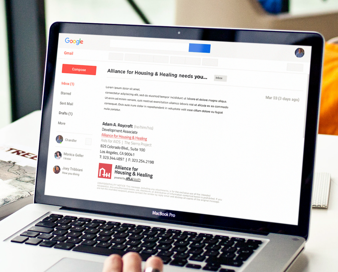
Your email signature should contain the following elements:
- Name
- Name Pronouns in Parentheticals (in Cool Gray)
- Title
- Alliance for Housing & Healing (in red linking to the www.alliancehh.org website)
- Aid for AIDS and The Serra Project (in Cool Gray)
- Address
- Telephone and Fax Number (or cell phone number)
- Logo
- Confidentiality Notice
Prounouns
(she/her/ella)
(he/him/his)
(he/him/él)
(they/them/theirs)
(ze/hir/hirs)
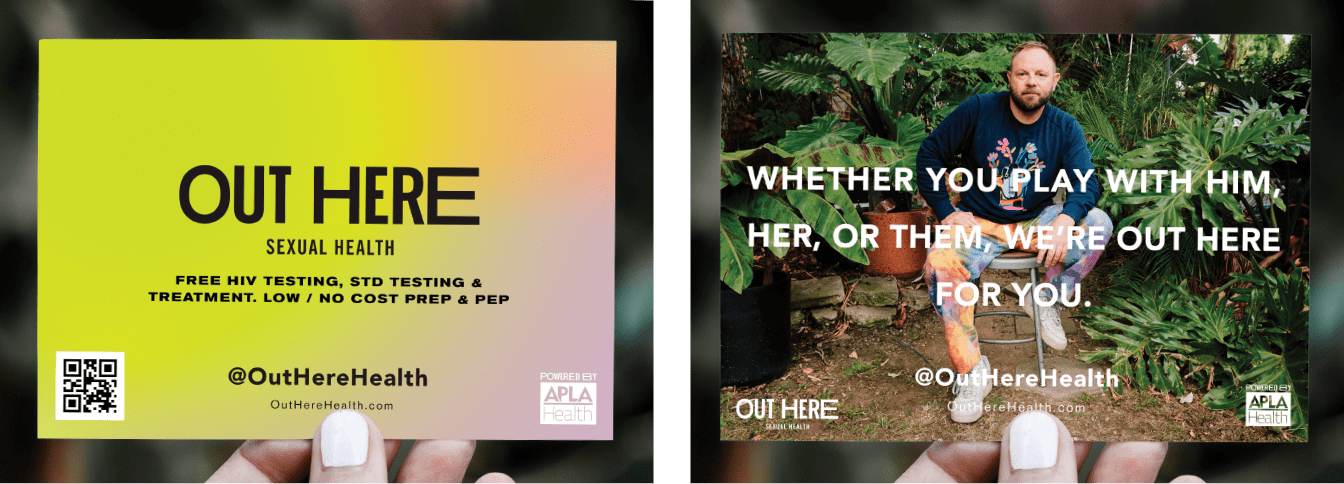
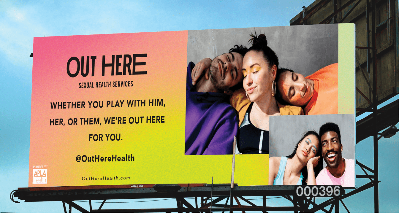
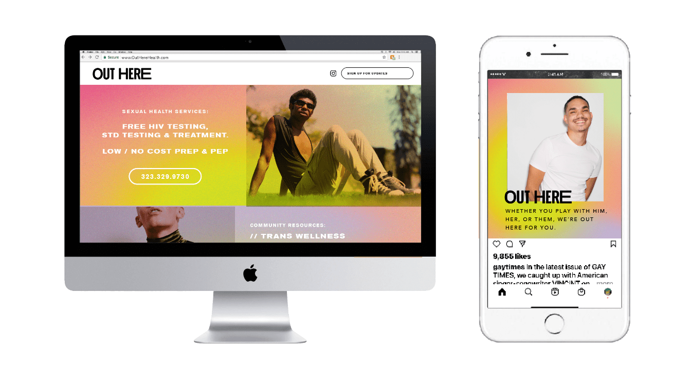
Out Here Sexual Health

Use “Powered by APLA Health” icon on all branded Out Here Sexual Health materials. Exempt for social media posts, though the APLA Health parent brand should be in Social Media bios.
Logo Family and Usage


Exclusion Zones
OK to omit subhead when logo issued as an icon under 150px wide.

Do’s and Dont’s


Color Palette
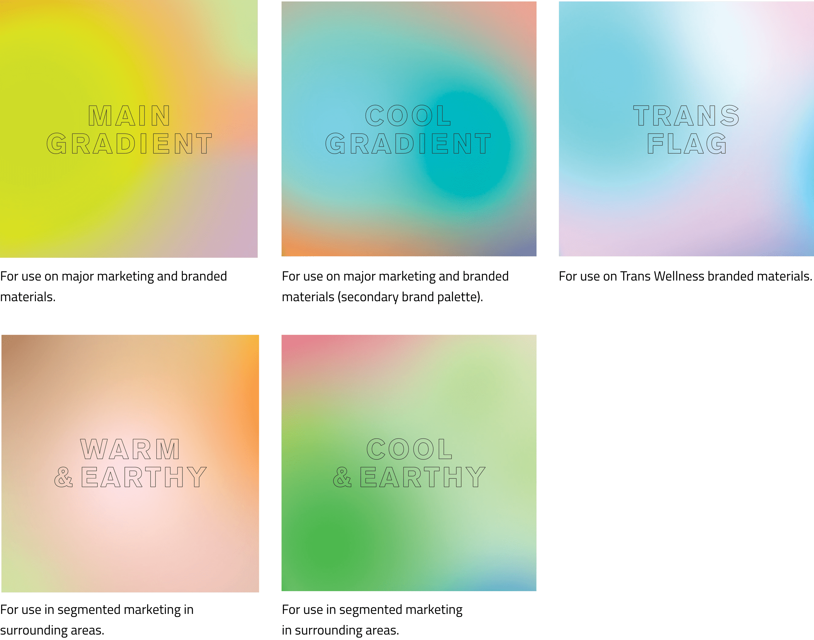
For specific usage of each gradient, refer to the swatches below.
Typography
For example, when talking about the url and handles; visit us at OutHereHealth.com, and tweet us @OutHereHealth.
A few examples on how to treat Out Here Sexual Health headlines & body copy, to the right.

Applications
Margins should be 1 inch on all sides (top, bottom, right, left). Exceptions can be made when working with a form or trying to ensure the text fits on one page.
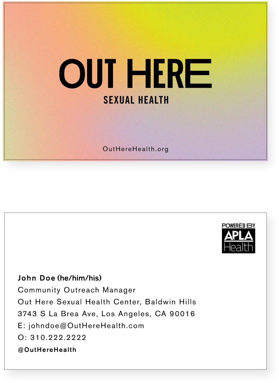
- Name
- Pronouns in Parentheticals
- Title
- Location
- Email address
- Telephone Number (or cell phone number)
- Out Here social
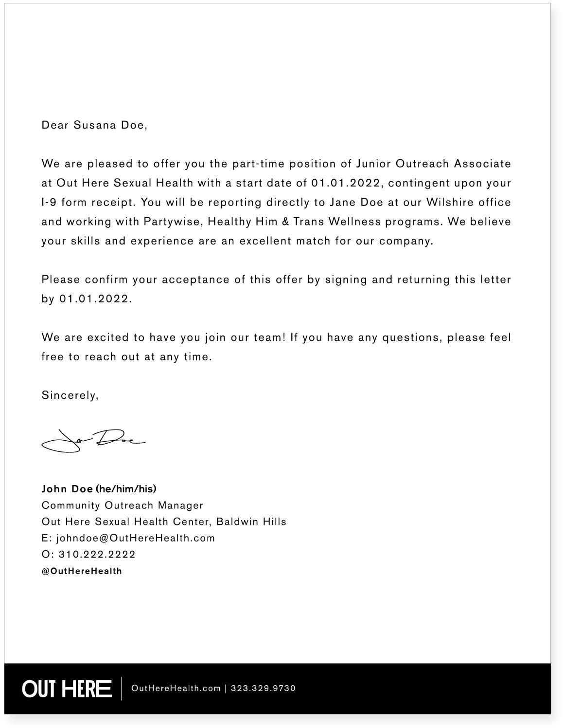

Outside of internal usage, the Out Here Sexual Health branded letterhead should not be used, and instead, use the co-branded letterhead pictured to the left. Your signature should contain the same elements that would appear on the primary letterhead.
If you have any questions, please reach out to the APLA Health marketing department.
To download the co-branded letterhead, please visit the APLA Health Brand Guidelines page.
Prounouns
(she/her/ella)
(he/him/his)
(he/him/él)
(they/them/theirs)
(ze/hir/hirs)
Additional Applications
