Brand Guidelines
APLA Health’s official logomark is comprised of the wordmark lockup with a solid bar in the same color.
The logo should always appear in full white or black. The black logo can be used on white or light colored backgrounds, and the white logo can be used on black, dark, or brightly-hued color backgrounds.
The color of the APLA Health logo should not change. If such a change is believed to be necessary, you must request approval from the Communications department.
Use the horizontal or vertically oriented logo depending on the space ratio available. For flat and wide spaces use the horizontal logo. For square or narrow and tall spaces use the vertical logo.


Logo Clear Space
The horizontal logo should never be smaller than 1 inch wide, and the vertical logo should never be smaller than .5 inch tall. Both logos should not be altered in any way.
The clear space around the logo should be equivalent to the width of the letter A in APLA.

Logo Do’s and Don’ts


Color Palette
The APLA Health color palette includes six primary colors, three greyscale colors, two sets of secondary brand colors with a set of twelve dark and light tones variations of the primary colors as well as a tertiary gradient spectrum for accent use. HEX codes are provided for digital use and CMYK values for print use.
The majority of compositions should stick to one color family, possibly including that color’s dark and/or light tones for variance and emphasis. Mixing colors should be restricted to extremely limited use such as multipage executions. When colors are mixed together in a composition, they should stick to the same value range, i.e., all in primary use, or all in dark tones, etc. Using the dark and light tones in compositions allows for more variance for the different programs as well as communicating differing event tones, such as lightheartedness or severity. Main organization programs should focus on the primary brand colors.
Primary & Secondary Colors
Primary Brand Colors

Primary Brand Colors: Greyscale

Secondary Brand Colors: Dark Tones

Secondary Brand Colors: Light Tones

Tertiary Brand Colors: Rainbow Spectrum

Typography
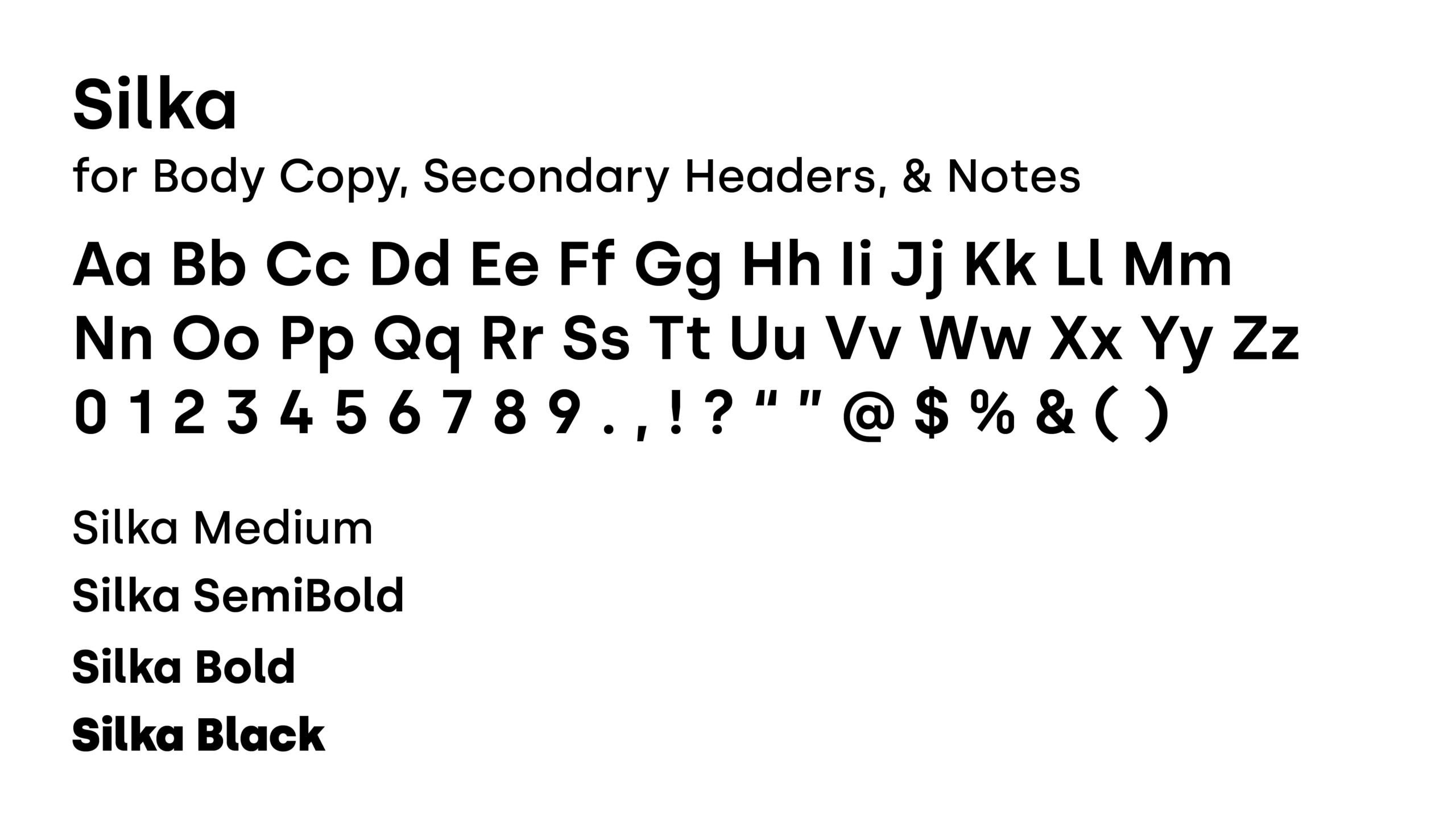
APLA Health’s typefaces are Fields and Silka. Fields has a single weight use case, medium. Fields should be used for primary headers in a composition only. All primary headers should be title case.
Silka has four weights that can be used depending on context including medium, semibold, bold, and black. Silka should be used in secondary headers, body copy, notes, and all other copy in a composition in varying weights. Secondary headers should be set in Silka Bold or Silka SemiBold depending on the size and the amount of copy. Body copy should be set in Silka Medium when the copy is a dark color on a light background, and Silka SemiBold when the copy is white/light toned on a dark background.


Applications
The application below showcases the usage of our general APLA Health icon pattern. In this instance, we’ve demonstrated how to treat a logo overlay on a pattern at 15% opacity to ensure our mark is always legible.
This includes removal of background icons in lieu of a color block. In design, mixed weights in headlines is encouraged. This added secondary design element echoes the logo and connects to our overall brand system.
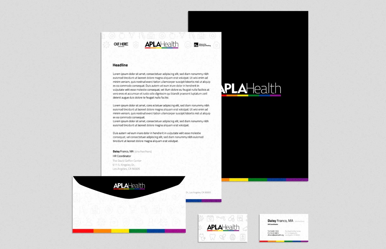
Your signature should contain the following elements:
First Name (Bold),
Last Name (Regular) followed by Pronouns in Parentheticals (Cool Gray)
Title
Telephone and Fax Number
Email address
Site name followed by address will be contained in the footer in Cool Gray.

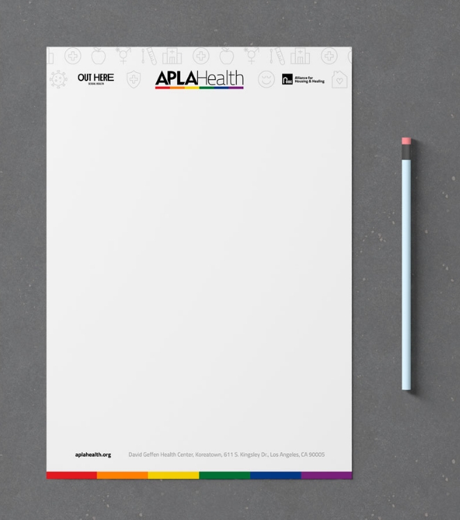
This application showcases what a blank letterhead should look like. All pre-printed letterhead features the APLA Health logo nested amongst our general vector pattern, the aplahealth.org url, and the branded rainbow bars at the botom of the page.
All copy should be nested between the header and footer.
This application showcases what co-branded letterhead will look like featuring APLA Health branding and other branded, entities that may fall beneath APLA. This example features the Out Here and AHH logos. This design features the same APLA Health brand elements as our primary letterhead, but these elements have been rearranged to accommodate additional brand logos. The APLA logo has been center justified and the Out Here/AHH logos are placed on either side of the main brand with the aplahealth.org URL centered on the bottom. All copy should appear below the header.
This layout allows for future iterations based on need; i.e. AWLA, Healthy Him, Party Wise, and other APLA Health co-branded letterhead. Your signature should contain the same elements that would appear on the primary letterhead.
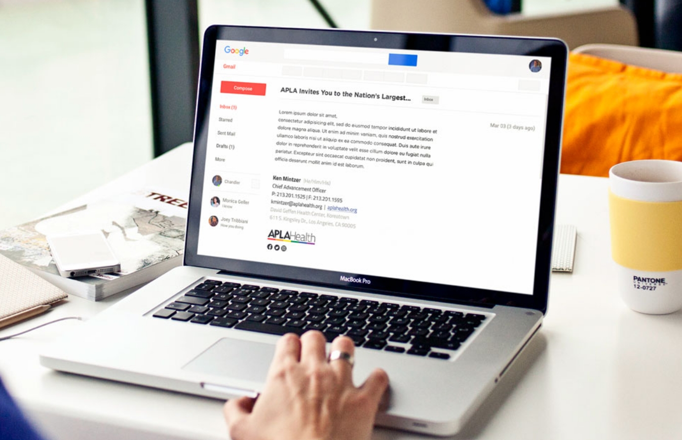
Below is a basic outline of an email signature when the logo is required to sit at the bottom.
Your email signature should contain the following elements:
Name (Bold) followed by Pronouns in Parentheticals (Cool Gray)
Title Telephone and Fax Number
Email address followed by the aplahealth.org (blue linking to the www.aplahealth.org website)
Site Name followed by Address (Cool Gray)
Logo Social Media Icons
Included in the template folder below are APLA Health and All Agency PowerPoints, a general APLA Health Word template, as well as a document to copy your APLA Health email signature into Outlook. For any other templates or design needs, please contact the Marketing Department.
Prounouns
(she/her/hers)
(she/her/ella)
(he/him/his)
(he/him/él)
(they/them/theirs)
(ze/hir/hirs)
Site Names
David Geffen Health Center, Koreatown
611 S. Kingsley Dr.
Los Angeles, CA 90005
Gleicher/Chen Health Center, Baldwin Hills
3743 S. La Brea Ave.
Los Angeles, CA 90016
APLA Health Center, Long Beach
1043 Elm Ave., Suite 302
Long Beach, CA 90813
APLA Health Center, Mid-Wilshire
5901 W. Olympic Blvd.
Los Angeles, CA 90036
APLA Health Dental Clinic, Downtown Los Angeles
1127 Wilshire Blvd., Suite 1504
Los Angeles, CA 90017
APLA Health Center, CDU/MLK Medical Campus
1679 E. 120th St.
Los Angeles, CA 90059
Out Here Sexual Health Center, Baldwin Hills
3741 S. La Brea Ave.
Los Angeles, CA 90016
Boilerplate Language
APLA Health (formerly AIDS Project Los Angeles) restores dignity and trust within underserved communities by providing world-class LGBTQ+ empowering healthcare, HIV specialty care, food, housing, and other essential support services. Since our founding in 1983, APLA Health has remained steadfast in our commitment to ending the HIV epidemic in our lifetime. We operate eight Federally Qualified Health Center (FQHC) locations in Los Angeles County, serving more than 19,000 people annually, regardless of ability to pay. Our list of comprehensive services includes LGBTQ+ primary care, dental care, behavioral healthcare, HIV specialty care, and Out Here Sexual Health services (PrEP, STD screening & treatment, DoxyPEP, and PEP). For people with HIV, our wraparound support services include housing assistance through the Alliance for Housing & Healing and nutritional support via the Vance North Necessities of Life Program, the largest food pantry in the United States for people with HIV, distributing over 800,000 meals annually. APLA Health’s annual fundraisers include AIDS Walk LA — the world’s first and oldest AIDS Walk — and Best in Drag Show. We are leaders in advocating for policy and legislation at the local, state and Federal levels that positively impact the LGBTQ+ and HIV communities. For more information on APLA Health, visit aplahealth.org.
The application below showcases a presentation template. The presentation template features the general vector pattern on title and divider slides. It also uses the branded rainbow bars along the bottom of each page. In design of a presentation, mixed weights in headlines and body copy is encouraged. This helps to emphasize important parts of content.

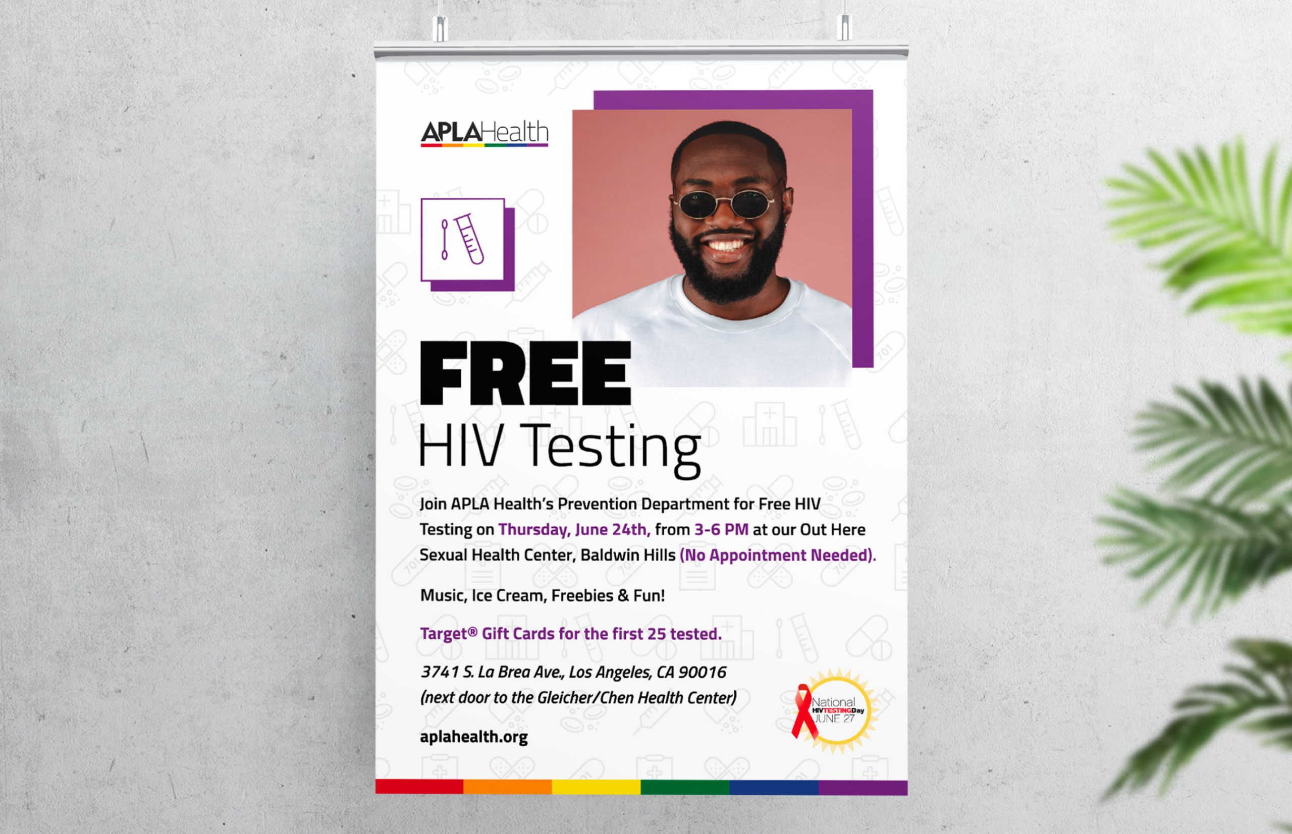
In this example of poster design, we’ve demonstrated how to treat a logo overlay on a pattern at 15% opacity to ensure our mark is always legible. This includes removal of background icons in lieu of a color block. Additionally, important imagery and iconography has been housed in squares (a shape derivative of our rectangles). The icon here has been lifted from our pattern for emphasis and color coded to match the featured color most prominent on the poster. Here we’ve created a faux drop shadow for emphasis in the color of our choosing (example is purple).
To ensure the white icon box doesn’t bleed into the background and stays connected to the drop shadow, a matching stroke should be included. If it interferes with typography, exclude the stroke around the box altogether. In design, mixed weights in headlines is encouraged. This added secondary design element echoes the logo and connects to our overall brand system. To ensure viewers grasp what is most important, critical information should be color coded to match the featured color on the poster. To ensure a design doesn’t become over saturated with color, italics can be used to highlight important information without color coding. When locking up an address, always include the site name. All posters must include: APLA Health Logo, aplahealth.org, APLA rainbow bars, an iconographic pattern that matches the content, and a feature icon.
The application below showcases how to treat text on a social media graphic. In this instance, important typography has been housed in a square (a shape derivative of our rectangles). Here we’ve created a faux drop shadow for emphasis in the color of our choosing (example is green). To ensure the white box doesn’t bleed into the image and stays connected to the drop shadow, a matching stroke should always be included. In design, mixed weights in headlines is encouraged.
This added secondary design element echoes the logo and connects to our overall brand system. Because this example features a call to action in regards to a APLA Health program/service, include the rainbow bars to refer back to the primary APLA branding. An APLA Health logo is not mandatory on a social media post as it is contained within a branded platform.

