Meet Best in Drag Show
For individual brand guidelines for Best in Drag Show, please see below:
Best in Drag Show

The logos above are our primary logomarks. These should be the default mark we use in most instances across our various outputs and formats.
Logo Family and Usage

When placing our logo on a full color background or when our logo appears on full color background of any color, use one of the full color logos above.


In instances in which we are limited to black and white formats, use the one of the logos above.
Profile pictures for social:

Exclusion Zones
The Best in Drag Show logo should never be smaller than 1 inch and should not be altered in any way from its original form.
Do not separate components of the logo or rearrange it in any way. The logomark and logotype should always remain in the same proportion and spacing to each other as indicated and may never be separated or used separately.

Do’s and Dont’s


Color Palette
The Best in Drag Show color palette includes three primary colors and their various tints/shades.
Color matching standard Pantone® references are included to ensure accuracy when reproducing the palette. Also included are the references for CMYK, RGB, and HEX values for consistency across different media. Where possible, the logos should be reproduced in the CMYK color process. Equivalent colors can be composed using the RGB and HEX references included when the logo is to be used digitally.

Typography
Header use
The header font is used to enhance the relationship between the headline and Best in Drag Show overall logo design. The header font should not be used for any large count copy, but rather is reserved for short and splashy headlines.

Body Copy Use
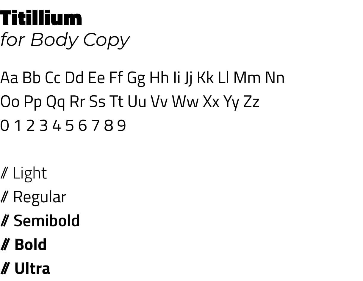
Best in Drag Show’s brand typeface is Titillium. This font comes with five weights; lighter weights such as Titillium Light and Titillium Regular should be reserved for body copy while Titillium Semibold, Bold, and Black should be reserved for adding emphasis to copy.
DO NOT use all caps for body copy or headlines unless absolutely necessary; i.e. on pieces that require additional emphasis.

Backgrounds
Color
Our background is made up of the three colors in our primary color palette, displayed as a fluid gradient. These colors connect Best in Drag Show to AHH / APLA Health as both were pulled directly from the AHH and APLA Health color palettes.
Bokeh Texture
Supporting our bright gradient is a bokeh texture designed to separate subjects from the background, thus adding extra emphasis to text, secondary imagery of Best in Drag Show performers, and calls to action.

